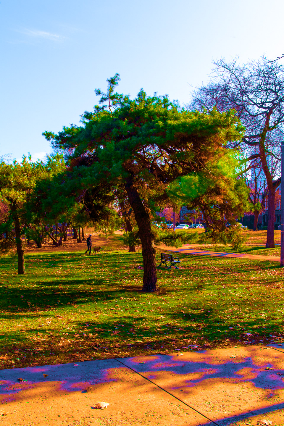
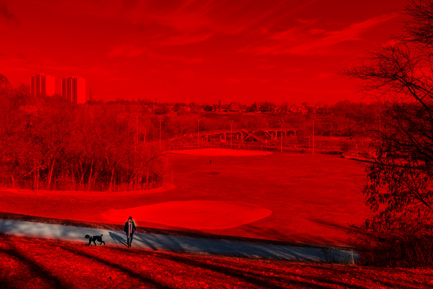

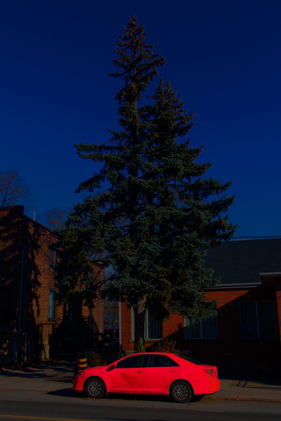
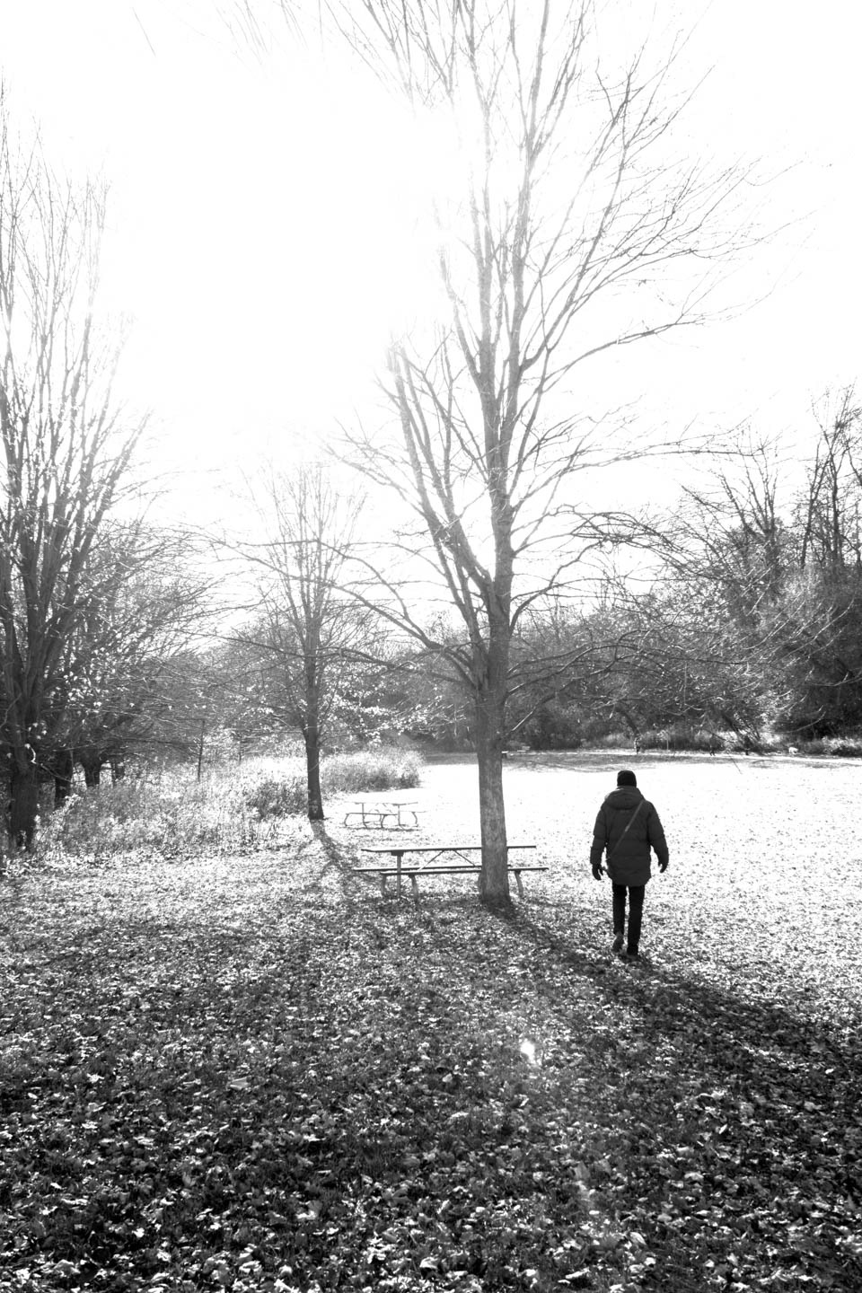
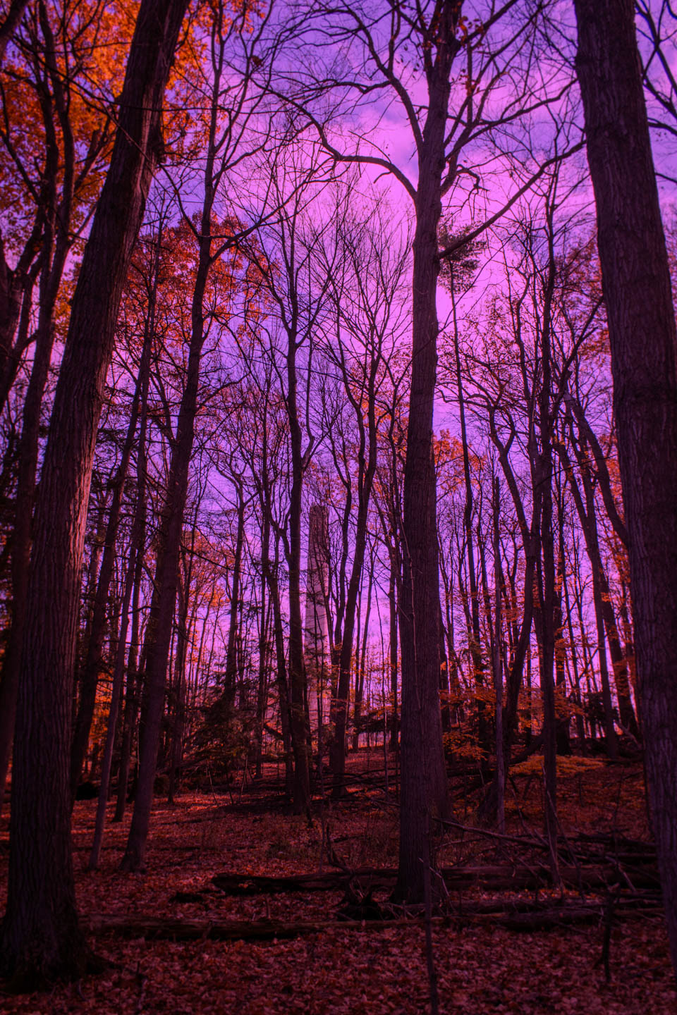
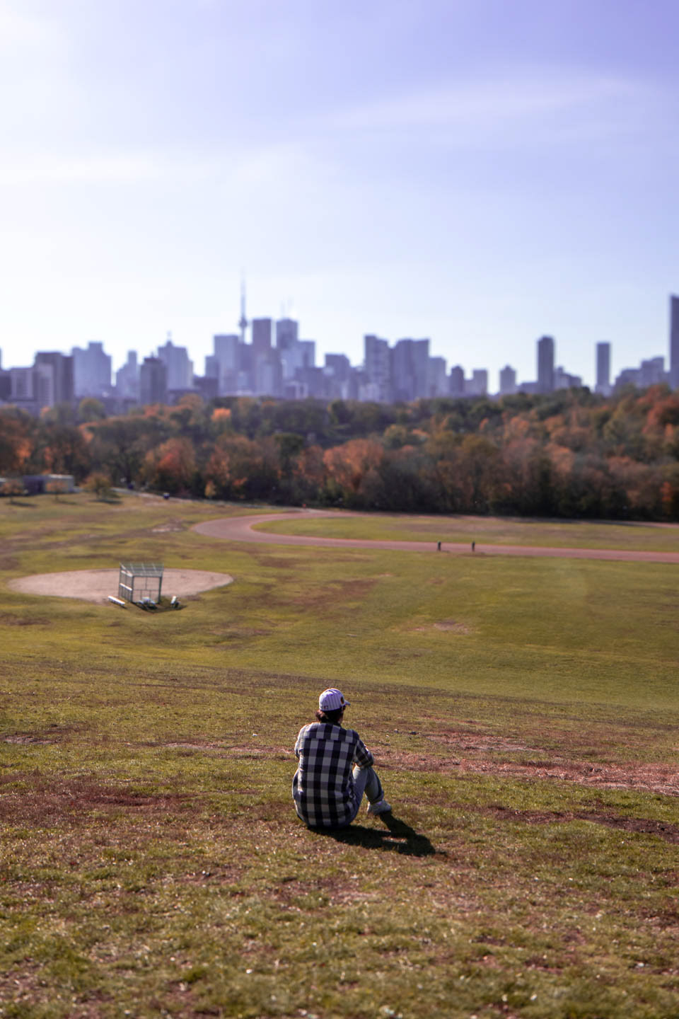
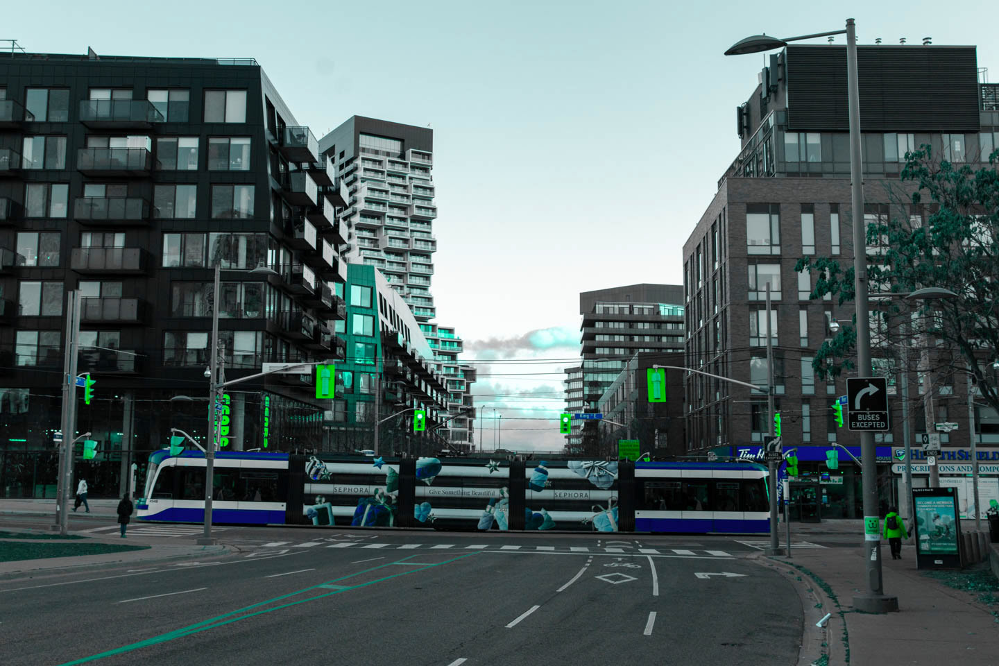
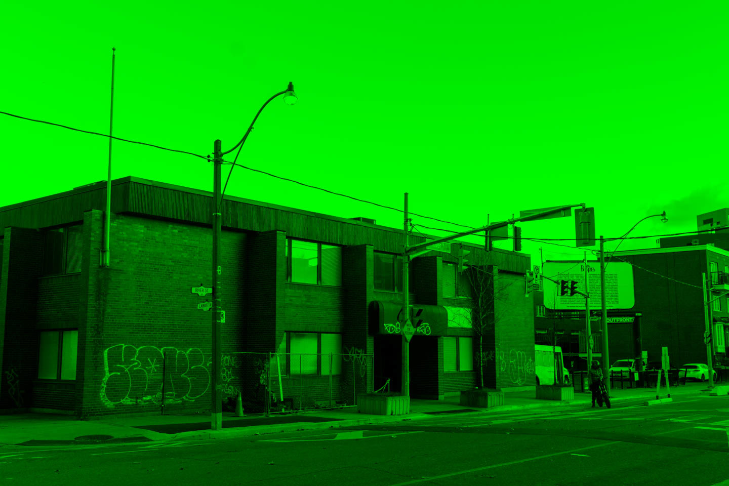

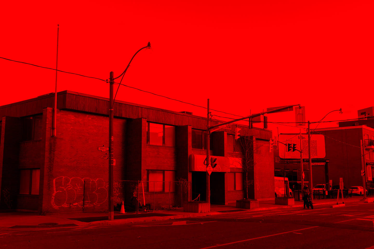

I have what’s called deutan colour blindness, which is a stronger deficiency in my eye’s green colour cones resulting in a type of red-green colour blindness. This means that red, yellow, green, and brown can appear similar, especially in low light. It’s also difficult to tell apart blues and purples, or pinks and greys. Although it comes up every now and then, I hadn't thought deeply about what this means for me as a photographer. It might happen subconsciously, but this condition could affect how I make many decisions in photography. Do I pick outfits and backgrounds that avoid colour blind complications? Do I edit my photos in a way that might suit my vision, but not for others? How do I make sure I have the right colour balance? This project was a way to finally explore my colour blindness in depth, and I started by experimenting with the colour mixer in Lightroom so that shades of green and blue were almost indistinguishable for me, but probably clear for others. This quickly led into a much crazier exploration of colour and, with use of Channel Mixer and blending modes in Photoshop, lead to a variety of images that investigate how colour works and how we perceive it.